
The Challenge: Questioning Conventional Wisdom in Technical Analysis
In technical analysis, the Relative Strength Index (RSI) threshold of 30/70 has been widely accepted for decades to identify potential overbought and oversold conditions in stocks. But here’s the problem: most resources promoting these thresholds rely on cherry-picked examples, often showing a single stock where the strategy happened to work well.
What if we could test these assumptions rigorously across hundreds of stocks and decades of market data? This case study demonstrates how comprehensive data analysis can transform accepted practices into quantifiable insights.
IMPORTANT DISCLAIMER: This analysis examines historical patterns in technical indicators for educational and research purposes only. Nothing in this discussion should be construed as investment advice or trading recommendations. Past performance does not guarantee future results.
The Analytical Approach
Data Foundation
The project analyzed approximately 500 stocks from the S&P 500, each with daily price data spanning from 2000 to 2025 (over 2.6 million individual observations). The data pipeline leveraged Python’s yfinance library for extraction, with all data organized into a SQLite database for efficient querying and management.
Feature Engineering
Rather than limiting analysis to the conventional 30/70 thresholds, the feature set expanded to include multiple threshold levels:
- Oversold thresholds: 10, 15, 20, 25, 30
- Overbought thresholds: 70, 75, 80, 85, 90
Each threshold generated both upward and downward crossover signals, creating 20 distinct binary indicators. Forward-looking returns were calculated for holding periods ranging from 1 to 25 days, simulating realistic scenarios where signals generate on one day but execution happens the following morning.
Visualization: Making Complex Data Accessible
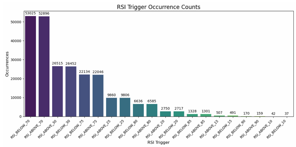
Signal Frequency Analysis
The frequency analysis revealed a clear inverse relationship – extreme thresholds like 10/90 generated only hundreds of signals across the entire dataset, while the conventional 30/70 thresholds produced over 100,000 occurrences. This visualization made immediately apparent the trade-off between signal rarity and frequency.
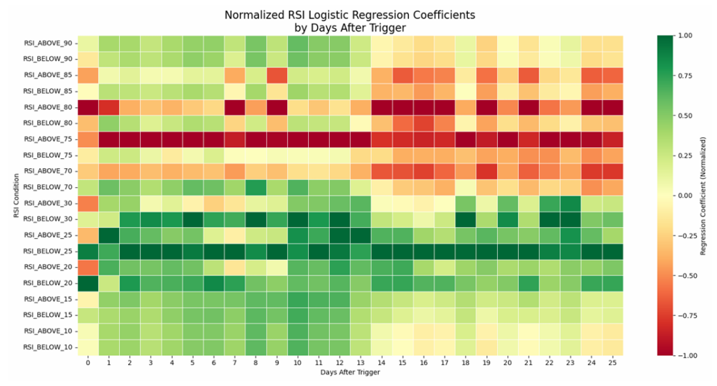
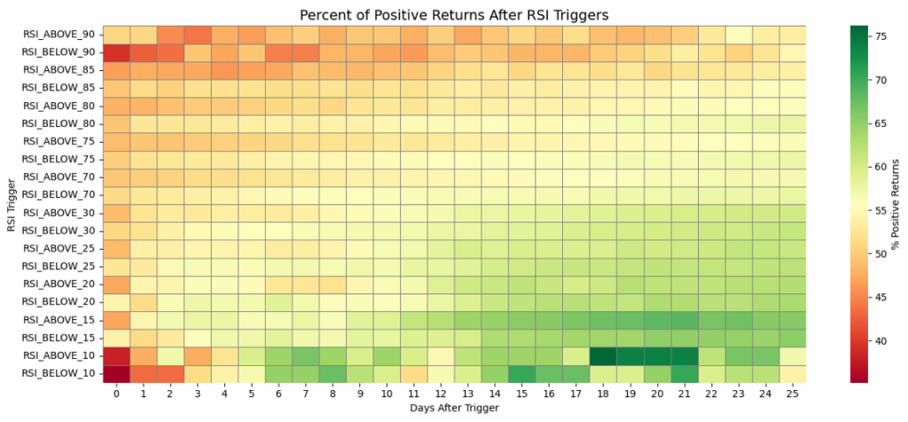
Heatmap Analysis: Patterns Across Time and Thresholds
Interactive heatmaps displayed logistic regression coefficients and random forest feature importance scores across two dimensions: threshold levels and days after trigger. These visualizations revealed temporal patterns that would be nearly impossible to detect in raw numbers.
The normalized coefficient heatmap showed that RSI_ABOVE_75 consistently generated negative coefficients in the 0-13 day window, while RSI_BELOW_25 showed sustained positive coefficients across most time horizons. Color gradients made these patterns visually obvious, enabling rapid pattern recognition.
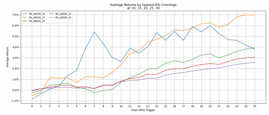
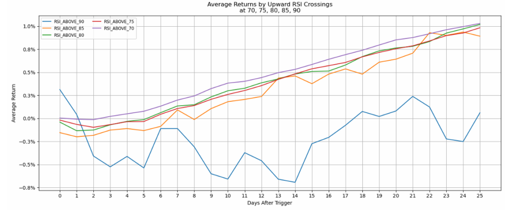
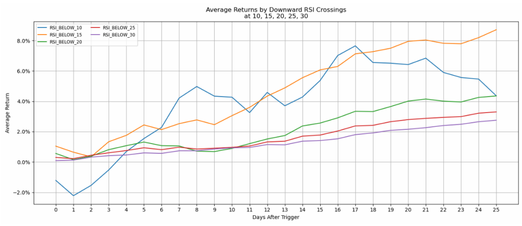
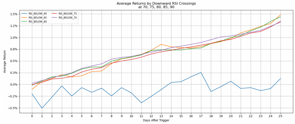
Return Trajectories
Line charts showing average returns over time following each threshold trigger revealed that most thresholds showed gradually increasing returns over the 25-day window – except for extreme levels like RSI_ABOVE_90, which displayed erratic, generally negative returns.
Probability Analysis
The probabilistic heatmap delivered an interesting insight: virtually none of the thresholds showed high probability of success within the first two weeks when considered in isolation. However, probability drifted upward as the time horizon extended past 14 days.
Machine Learning: Extracting Patterns from Complexity
Logistic Regression for Directional Relationships
Logistic regression models quantified the relationship between each threshold trigger and the probability of positive returns. The coefficient heatmaps revealed clear demarcations: thresholds at 70 and above concentrated negative coefficients, while thresholds at 30 and below concentrated positive coefficients.
RSI_BELOW_25 maintained consistently positive coefficients across virtually all time horizons, while RSI_ABOVE_75 showed the strongest negative coefficients in the 0-13 day window before the relationship weakened for longer holding periods.
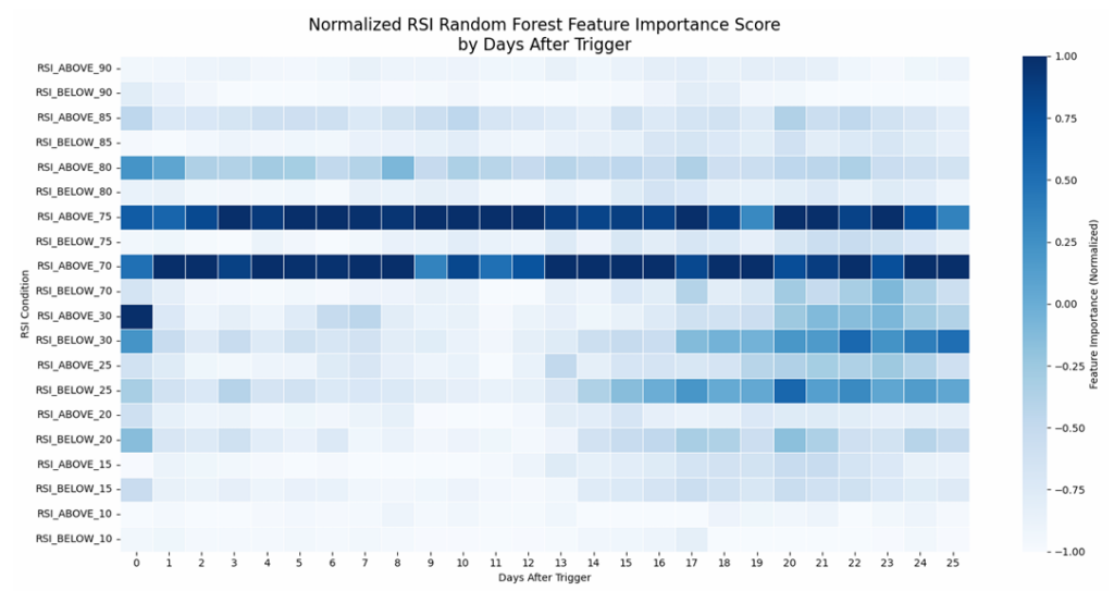
Random Forest for Non-Linear Pattern Recognition
Random forest ensemble models captured complex, non-linear interactions between features. The feature importance scores revealed that RSI_ABOVE_70 and RSI_ABOVE_75 consistently ranked highest across most time horizons.
The analysis also revealed temporal dynamics: upper threshold levels showed higher importance for short-term predictions (0-13 days), while lower threshold levels gained importance for longer-term predictions (14-25 days).
The Value of Comprehensive Analysis
Challenging Assumptions with Evidence
The most significant value this analysis provides is the systematic methodology for questioning assumptions that previously relied on anecdotal evidence. By testing the conventional 30/70 paradigm against alternative configurations across 500 stocks and 25 years, the analysis replaces speculation with quantified patterns.
The data revealed that while 30/70 generates frequent signals, other thresholds like 25/75 show interesting statistical relationships. More importantly, no single threshold configuration dominates across all time horizons – the optimal choice depends on the specific holding period and objectives.
From Numbers to Narrative
The visualization strategy transformed numerical outputs into visual narratives that communicate insights efficiently:
- Color-coded heatmaps reveal patterns across two dimensions simultaneously
- Temporal line charts show how relationships evolve over holding periods
- Boxplot distributions communicate not just central tendencies but variance and outliers
- Bar charts provide immediate comparison of signal frequencies
This multi-modal approach ensures insights are accessible to audiences with varying technical backgrounds.
Reproducible, Scalable Methodology
The project architecture (from data acquisition through database management to feature engineering, model training, and visualization) provides a template for similar analytical questions across domains. The Python-based toolchain (pandas, scikit-learn, seaborn/matplotlib/plotly) represents an industry-standard approach that scales from exploratory analyses to production-grade analytics.
Broader Applications: Data Science for Decision Support
While this case study focused on technical analysis indicators, the methodology exemplifies how data science creates value across domains:
Operations Analysis: Which inspection tolerances optimize defect detection without excessive false positives across different production timescales?
Customer Behavior Modeling: Which behavioral indicators best predict conversion, retention, or churn at different customer lifecycle stages?
Industrial Process Optimization: How do temperature, pressure, or flow thresholds relate to product quality metrics across different process durations?
Healthcare Diagnostics: How do different cutoff values for biomarkers relate to health outcomes at various follow-up periods?
In each case, the analytical framework remains consistent: collect comprehensive historical data, engineer relevant features, apply machine learning to extract patterns, visualize results for accessibility, and acknowledge limitations transparently.
Conclusions
This RSI crossover analysis demonstrates how modern data science techniques transform vague conventional wisdom into quantified, nuanced understanding. The value isn’t prescriptive (telling analysts which threshold to use) but descriptive – showing what patterns actually exist in historical data.
This methodology scales beyond financial technical analysis to any domain where thresholds, triggers, or decision rules get applied based on tradition rather than systematic evidence. Whether optimizing manufacturing processes, customer engagement strategies, or sensor calibration, the framework remains constant: collect comprehensive data, engineer meaningful features, apply appropriate machine learning techniques, visualize results effectively, and communicate findings with appropriate uncertainty.
Interested in applying data science and machine learning to your analytical challenges? Whether you’re questioning conventional assumptions, optimizing threshold-based decision rules, or building data-driven frameworks, systematic analysis can transform speculation into quantified insight.
Contact me to discuss how comprehensive data analysis can illuminate patterns hidden in your data.